Bivariate Data Analysis: Categorical and Quantitative Relationships
Unit 2: Exploring Two-Variable Data
Relationships Between Categorical Variables
In Unit 1, we analyzed single variables. In Unit 2, we move to bivariate data—data involving two variables—to determine if there is an association between them.
Two-Way Tables (Contingency Tables)
When analyzing two categorical variables, we organize counts in a two-way table. The rows represent one variable and the columns represent the other.
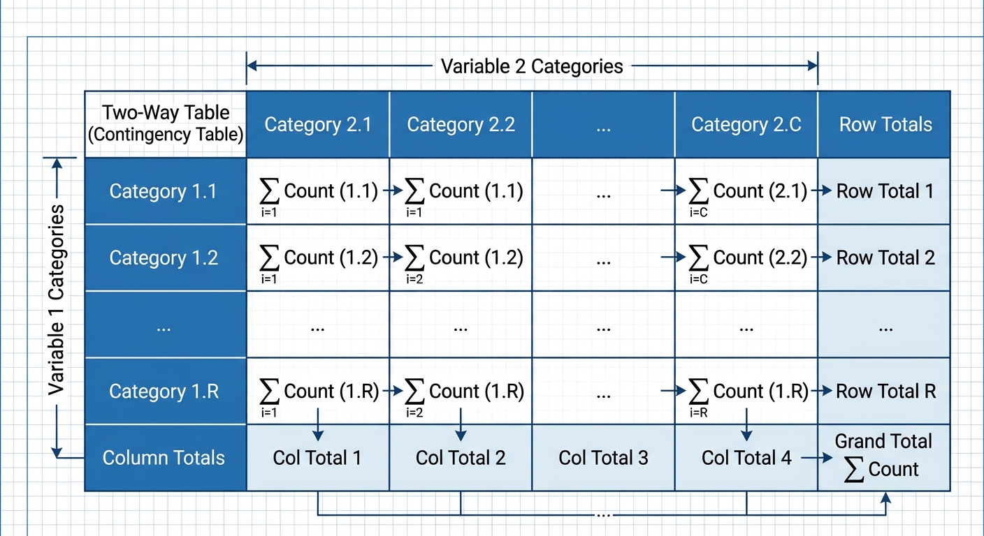
➥ Example: The Cuteness Factor
A study asked 250 volunteers to view pictures (Baby Animals, Adult Animals, or Food) and then measured their Focus Level (Low, Medium, High) on a puzzle.
| Pictures (Row) | High Focus | Medium Focus | Low Focus | Total |
|---|---|---|---|---|
| Baby Animals | 80 | 15 | 5 | 100 |
| Adult Animals | 30 | 45 | 25 | 100 |
| Tasty Foods | 10 | 10 | 30 | 50 |
| Total | 120 | 70 | 60 | 250 |
Marginal vs. Conditional Distributions
Marginal Distribution: Analyzes only one of the variables in the table using the totals from the bottom row or right column.
- Example: What percent of all participants achieved High Focus?
Conditional Distribution: Distribution of one variable limited to a specific category of the other variable (restricting the denominator).
- Example: Given that a person looked at Baby Animals, what percent achieved High Focus?
Independence and Association
This is a critical concept in AP Statistics.
- Two variables are associated if knowing the value of one variable helps predict the value of the other.
- Two variables are independent if the conditional distribution of one variable is the same for every category of the other variable.
Test for Independence: Compare the conditional distributions. If $P(A|B) \approx P(A)$, they are likely independent. If the percentages differ significantly across categories, there is an association.
In the Cuteness example, 80% of "Baby Animal" viewers had High Focus, compared to only 20% of "Tasty Food" viewers. Since , Focus Level and Picture Type are associated.
Graphical Displays
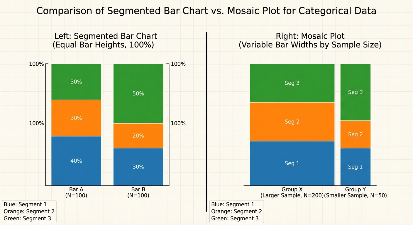
- Side-by-Side Bar Chart: Bars are grouped together for comparison.
- Segmented (Stacked) Bar Chart: Each bar represents 100% of a category, divided into segments for the second variable.
- Mosaic Plot: Similar to a segmented bar chart, but the width of the bars corresponds to the sample size of each group.
Relationships Between Quantitative Variables
When both variables are quantitative (numerical), we look for a functional relationship, typically linear.
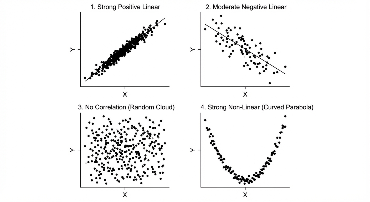
Scatterplots and Description (DUFS)
A scatterplot places the explanatory variable ($x$) on the horizontal axis and the response variable ($y$) on the vertical axis. When describing a scatterplot on an exam, you MUST address these four characteristics in context:
- Direction: Positive (uphill) or Negative (downhill).
- Unusual Features: Outliers or distinct clusters.
- Form: Linear or curved/nonlinear.
- Strength: Weak, moderate, or strong (how tightly points fit the form).
Correlation ($r$)
The correlation coefficient, denoted by $r$, measures the strength and direction of a linear relationship.
Properties of $r$:
- Range:
- Direction: Sign of $r$ matches the direction of the association.
- Strength: Values near $\pm 1$ are strong; values near 0 are weak.
- Linearity: $r$ only describes linear relationships. You can calculate $r$ for a curve, but it is misleading.
- Unitless: Changing units (e.g., feet to meters) does not change $r$.
- Robustness: $r$ is not resistant to outliers. A single outlier can drastically change $r$.
- Causation: Correlation $\neq$ Causation.
Linear Regression Models
A regression line describes how a response variable $y$ changes as an explanatory variable $x$ changes. We use this line to predict values.
The Least Squares Regression Line (LSRL)
The LSRL is the unique line that minimizes the sum of the squared residuals ($ \sum (y - \hat{y})^2 $).
Equation:
- (pronounced "y-hat"): The predicted value of the response variable.
- : The y-intercept.
- : The slope.
- : The explanatory variable.
Interpreting Slope and Intercept
On the AP Exam, use these precise templates:
| Term | Standard Interpretation Template |
|---|---|
| Slope ($b$) | "For every 1 unit increase in [x-variable name], the predicted [y-variable name] changes by [slope value]." |
| Y-Intercept ($a$) | "When the [x-variable name] is 0, the predicted [y-variable name] is [y-intercept value]." (Only interpret if x=0 makes sense in context). |
Calculating the Line from Stats
If you don't have the raw data but have the summary statistics (mean and standard deviation), you can calculate the slope and intercept algebraically:
Key Property: The LSRL always passes through the point .
Assessing the Fit of the Model
How do we know if our line is a good model?
1. Residuals
A residual is the difference between an observed value and a predicted value.
- Negative Residual: The point is below the line (Model overestimated).
- Positive Residual: The point is above the line (Model underestimated).
- Sum of Residuals: Always equals zero for the LSRL.
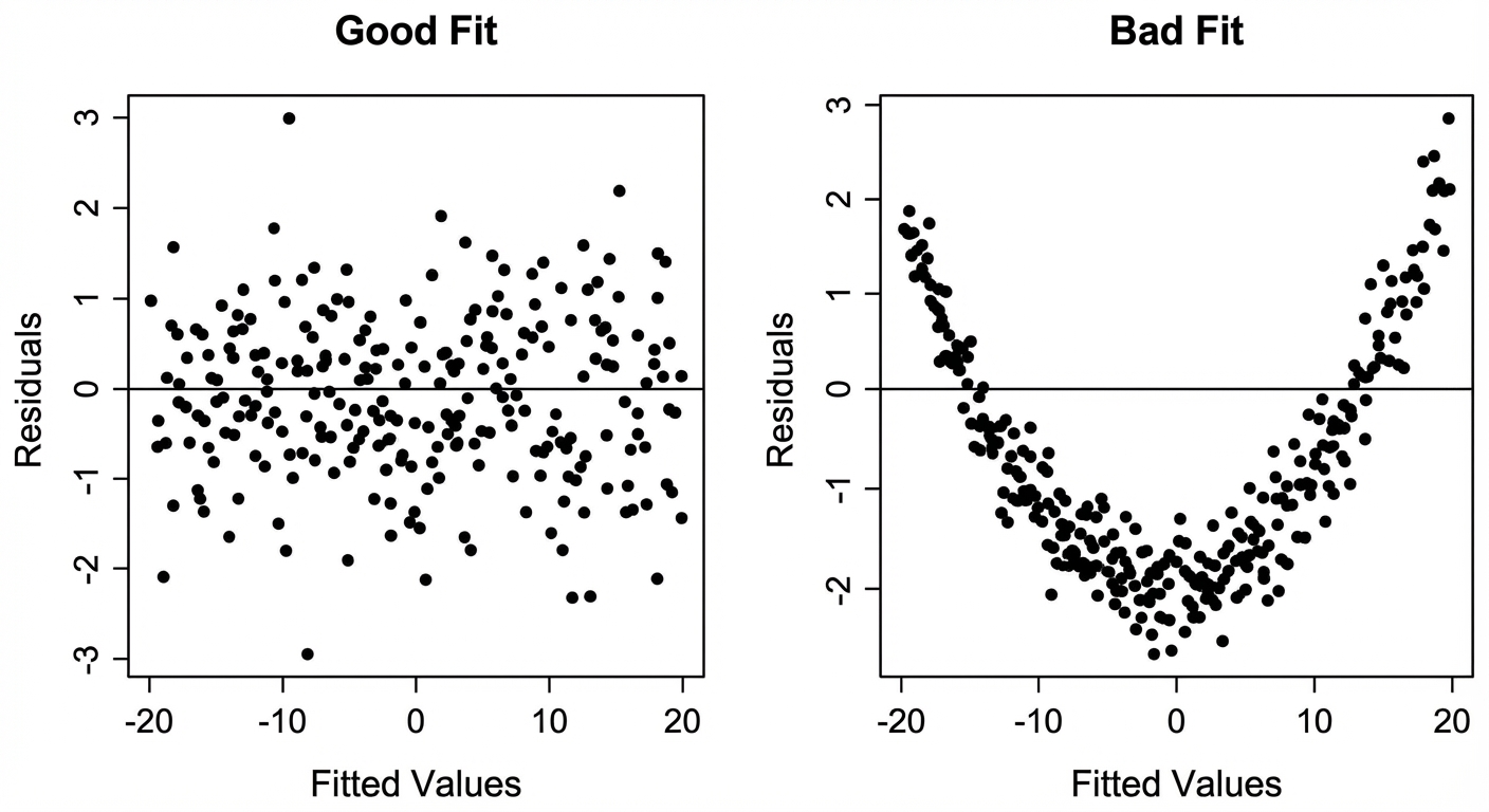
2. Residual Plots
A residual plot graphs the residuals on the y-axis against the explanatory variable ($x$) on the x-axis. This is the primary tool to check the linearity assumption.
- Random Scatter (No pattern): The linear model is appropriate.
- Curved Pattern (U-shape): The original data is nonlinear; a linear model is not appropriate.
- Fanning (Cone shape): The linear model is not appropriate because prediction error changes as $x$ increases.
3. Standard Deviation of the Residuals ($s$)
This value roughly measures the "average distance" of the actual data points from the regression line.
Interpretation:
"The actual [y-variable] matches the predicted [y-variable] typically within [value of $s$] units."
4. Coefficient of Determination ($r^2$)
$r^2$ represents the fraction of variation in the y-variable that is explained by the model.
Interpretation:
"Approximately [percentage]% of the variation in [y-variable] is accounted for by the linear relationship with [x-variable]."
Calculating relationship: If $r^2 = 0.64$, then $r = \pm \sqrt{0.64} = \pm 0.8$. You must check the slope direction to determine if $r$ is positive or negative.
5. Reading Computer Output
AP exams frequently provide software output instead of raw data. You must be able to extract the equation.
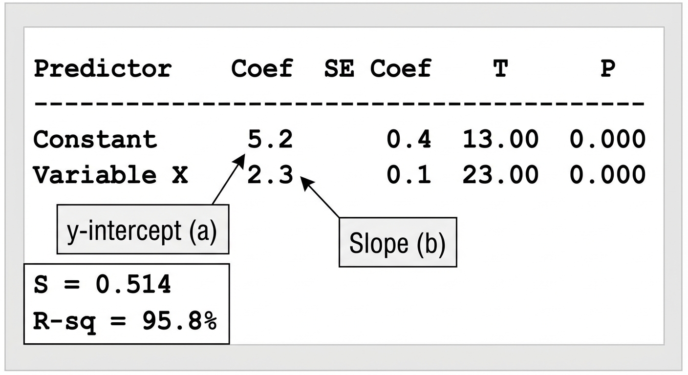
- Coef (Constant): This is the y-intercept ($a$).
- Coef (Variable Name): This is the slope ($b$).
- S: Standard deviation of residuals.
- R-Sq: The coefficient of determination ($r^2$).
Unusual Features & Transformations
Outliers vs. High Leverage vs. Influential Points
- Regresson Outlier: A point with a large residual (far from the line vertically). It weakens the correlation.
- High Leverage Point: A point with an $x$-value far from the mean of $x$ ($\bar{x}$). It sits far to the left or right of the pack.
- Influential Point: A point that, if removed, substantially changes the slope, y-intercept, or correlation. High leverage points are often influential if they do not align with the trend.
Transformations to Achieve Linearity
If a residual plot shows a curve, the relationship is not linear. We can transform the data (using logs, typically) to "straighten" the scatterplot.
Exponential Model ($y = ab^x$):
- Plot $x$ vs. $\ln(y)$.
- If this graph is linear, the original relationship is exponential.
Power Model ($y = ax^p$):
- Plot $\ln(x)$ vs. $\ln(y)$.
- If this graph is linear, the original relationship is a power function.
Common Mistakes & Pitfalls
- Correlation vs. Slope: Students often confuse $r$ and $b$. $r$ is strength (between -1 and 1); $b$ is the rate of change (can be any number). They have different units but the same sign (+/-).
- "Predicted": When writing the regression equation or interpreting y-values, you MUST use the word "predicted" or the symbol $\hat{y}$. Writing $y = 3x + 2$ implies the line hits every point perfectly, which is false.
- Extrapolation: Predicting values outside the range of observed $x$ data is dangerous and often inaccurate. Always mention this limitation.
- Describing Scatterplots: Forgetting "Context". Never just say "It's a strong positive linear relationship." Say "There is a strong, positive, linear relationship between height and weight."
- Bar Charts vs. Histograms: Remember that Unit 2 categorical data uses Bar Charts (gaps between bars), not Histograms (quantitative data, no gaps).