AP Statistics Unit 1: Exploring One-Variable Data
Exploring One-Variable Data
Variation in Categorical and Quantitative Variables
Statistics begins with data—information about a group of individuals. To analyze this data effectively, we must first classify exactly what type of variables we are looking at. The methods used to graph and analyze data depend entirely on this classification.
Definitions & Terminology
- Individual: The objects described by a set of data (e.g., people, animals, things).
- Variable: Any characteristic of an individual. A variable can take different values for different individuals.
- Distribution: Tells us what values the variable takes and how often it takes these values.
Types of Variables
There are two main categories of variables. You must be able to distinguish between them immediately.
Categorical Variable: Places an individual into one of several groups or categories.
- Examples: Eye color, gender, zip code, area code, grade level (Freshman, Sophomore, etc.).
- Note: Just because a variable looks like a number (like a zip code) doesn't mean it is quantitative. If averaging the numbers makes no sense (e.g., the average zip code of a class is meaningless), it is categorical.
Quantitative Variable: Takes numerical values for which it makes sense to find an average.
- Examples: Height, weight, GPA, salary, number of siblings.
- Discrete Quantitative: Can only take a countable number of values (usually integers). "Gaps" exist between values. (e.g., Shoe size, number of petals on a flower).
- Continuous Quantitative: Can take any value within an interval. (e.g., Time to run a mile, exact height).
Representing Data with Graphs
Once variables are identified, we use specific graphs to visualize the distribution. The choice of graph depends on the variable type.
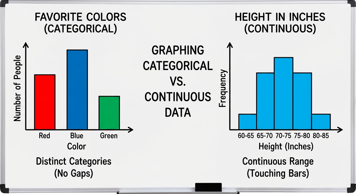
Graphing Categorical Data
We typically summarize categorical data using a Frequency Table (count of individuals) or a Relative Frequency Table (percent of individuals).
Bar Charts
- Represents each category as a bar.
- The height shows the frequency (count) or relative frequency (percent).
- Crucial Rule: Bars must have spaces between them to indicate that categories are separate and not continuous.
Graphing Quantitative Data
1. Dotplots
One of the simplest graphs to construct and interpret.
- Each data value is shown as a dot above its location on a number line.
- Pros: Shows every individual data value; easy to see shape.
- Cons: Becomes tedious with large datasets.
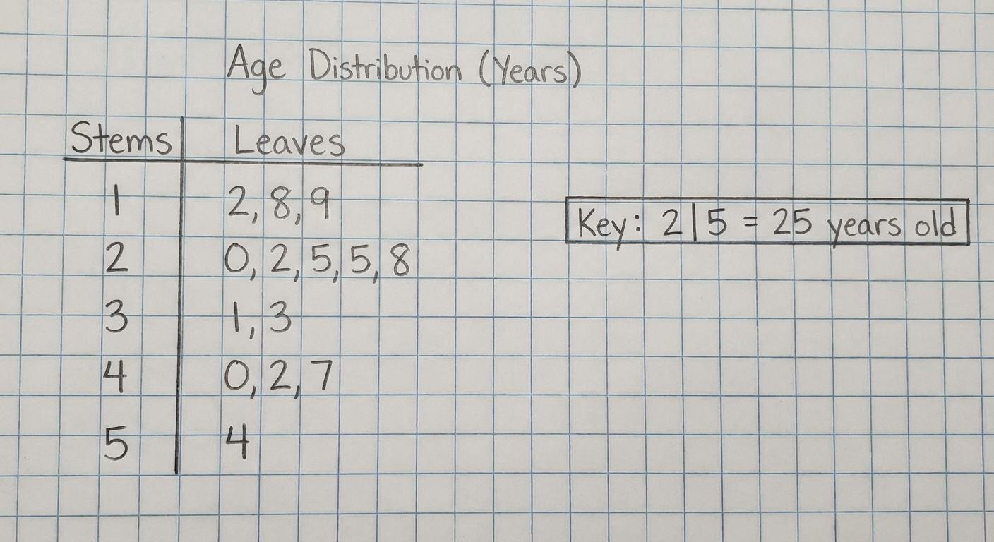
2. Stemplots (Stem-and-Leaf Plots)
Stemplots separate each observation into a stem (all but the final digit) and a leaf (the final digit).
- Requirement: You MUST include a KEY explaining what the stem and leaf represent (e.g., "Key: 8 | 2 means 82 mg").
- Split Stems: If data is bunched together, you can split stems (e.g., use 1-4 for the first stem of '1' and 5-9 for the second stem of '1').
- Back-to-Back Stemplots: Used to compare two distinct datasets using a common stem in the middle.
3. Histograms
Used for larger datasets of quantitative variables.
- Divides the range of data into classes (bins) of equal width.
- The height of the bar corresponds to the frequency or relative frequency of that class.
- Crucial difference from Bar Charts: There are NO SPACES between bars in a histogram (unless a class is empty), indicating the data is continuous along the number line.
Describing the Distribution of a Quantitative Variable
In AP Statistics, when asked to "describe the distribution" of a quantitative variable, you generally do not just list numbers. You must address four specific characteristics.
The Golden Rule: SOCS + Context
Use the mnemonic SOCS to ensure you cover all required aspects.
Important: You must always write your answer in context. Do not just say "The mean is 5." Say "The mean weight of the hamsters is 5 grams."
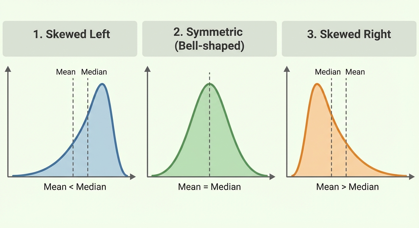
1. Shape (S)
Describe the overall pattern of the graph.
- Symmetric/Roughly Symmetric: The left and right sides are mirror images.
- Skewed Right (Positive Skew): The right side (tail) is much longer than the left. The "tail" points to the right.
- Skewed Left (Negative Skew): The left side (tail) is much longer than the right. The "tail" points to the left.
- Modes:
- Unimodal: One distinct peak.
- Bimodal: Two distinct peaks.
- Uniform: No distinct peaks; data is flat.
2. Outliers (O)
Identify any unusual values that fall outside the overall pattern.
- Visually: Look for gaps or isolated points.
- Mathematically (The 1.5 Rule):
- Any value outside these limits is an outlier.
3. Center (C)
Describe the middle of the distribution.
- Median: The midpoint of the distribution. (Use this for skewed data or data with outliers).
- Mean (): The arithmetic average. (Use this for symmetric data).
Relationship between Mean and Median based on Shape:
- Skewed Left: Mean < Median (The tail drags the mean down).
- Symmetric: Mean $\approx$ Median.
- Skewed Right: Mean > Median (The tail pulls the mean up).
4. Spread (S)
Describe how much variation is in the data.
- Range: (A single number, not an interval).
- Interquartile Range (IQR): (The range of the middle 50%).
- Standard Deviation (): The average distance of data points from the mean.
- Note: If you use the Median for center, use IQR for spread. If you use Mean for center, use Standard Deviation for spread.
Comparing Distributions
Frequently, AP questions ask you to "Compare the distributions" of two datasets (e.g., Class A vs. Class B test scores).
- Use Comparative Language: You must use words like greater than, less than, similar to, or about the same. Listing the statistics for Group A and then Group B separately will result in zero credit.
- Bad: "Group A has a median of 5. Group B has a median of 10."
- Good: "The median of Group B (10) is greater than the median of Group A (5)."
- Address SOCS: Compare the Shape, Outliers, Center, and Spread for both groups.
Common Mistakes & Pitfalls
- Categorical vs. Quantitative Confusion: Thinking zip codes or jersey numbers are quantitative. Always ask: "Does the average make sense?"
- Bar Chart vs. Histogram: Drawing a histogram with gaps or a bar chart without them. Histograms represent continuous number lines; bar charts represent distinct categories.
- Forgetting Context: Writing a generic description (e.g., "The distribution is skewed right") without mentioning the variable (e.g., "The distribution of salaries is skewed right"). This is the most common reason to lose points on Free Response Questions (FRQ).
- Skewness Direction: Thinking the big clumps of data define the skew. No! The tail defines the skew. If the tail points to the right (positive numbers), it is Skewed Right.
- Mean/Median Confusion: Forgetting that the Mean is non-resistant (sensitive to outliers), while the Median is resistant. In skewed distributions, the mean is pulled toward the tail.