AP Statistics Unit 1 Study Guide: Exploring One-Variable Data (Distributions, Graphs, Summaries, and Normal Models)
Data, Variables, and the Idea of a Distribution
Statistics starts with a simple goal: use data from a process (often messy and variable) to learn something reliable. In Unit 1, you focus on one-variable data, meaning each individual (also called an observational unit) contributes one measurement or one category value. Even with one variable, you can learn a lot by organizing, visualizing, and summarizing how values are distributed.
A good mental model is this: a dataset is not just a list of numbers; it is evidence about a process. Your job is to describe what the evidence says clearly, honestly, and in context.
Individuals, variables, and data types
An individual is the object described by the data: a person, product, day, school, etc. A variable is the characteristic recorded for each individual.
AP Statistics emphasizes matching methods to the variable type:
- A categorical (qualitative) variable takes values that are category names or group labels (for example, blood type, brand preference). The “values” are labels.
- A quantitative variable takes numerical values for a measured or counted quantity (for example, height, reaction time, number of visits). Arithmetic has meaning.
A common mistake is treating “numbers” as automatically quantitative. For example, a ZIP code or an ID number looks numeric but is categorical because averaging ZIP codes or IDs is meaningless.
Discrete vs continuous quantitative variables
A quantitative variable can be:
- Discrete quantitative: takes a finite or countable number of values, with visible “gaps” between possible values (for example, number of AP classes).
- Continuous quantitative: can take infinitely many values in an interval with no gaps (for example, height or weight).
What “distribution” means (and why it is central)
The distribution of a variable tells you what values occur, how often they occur, and the overall pattern of the data. Distribution is how you see variability, which is the single most fundamental concept in statistics.
For quantitative variables, distributions are described using shape, center, spread, and unusual features (outliers, gaps, clusters). For categorical variables, distributions describe how counts or proportions are allocated across categories.
Descriptive vs inferential statistics
- Descriptive statistics: presenting data through summaries and descriptions, including typical values, variability, relative standing, and shape.
- Inferential statistics: drawing conclusions from limited data about a broader situation; this becomes central in later units.
Frequency and relative frequency
A frequency is a count in a category or bin. A relative frequency is a proportion (or percent) of the total. Relative frequencies are especially helpful when comparing groups with different sample sizes.
If the total number of observations is n and a category has count c, then relative frequency is:
Be consistent about whether you report proportions (0 to 1) or percents (0 to 100).
Worked example: identifying variable type
A gym records the following for each member: (1) membership ID number, (2) number of visits last month, (3) whether the member used a personal trainer (yes/no).
- Membership ID: categorical (an identifier)
- Visits: quantitative (counts; arithmetic makes sense)
- Trainer use: categorical
Exam Focus
- Typical question patterns:
- Identify individuals and variables; classify variables as categorical vs quantitative (and discrete vs continuous when relevant).
- Explain why a particular graph/summary is appropriate for the variable type.
- Interpret a distribution in context (what does the pattern imply?).
- Common mistakes:
- Treating numeric labels (IDs, ZIP codes) as quantitative.
- Describing a dataset without context or units (for example, “center is 72” instead of “median score is 72 points”).
- Confusing individuals (who/what) with variables (what is measured).
Displaying Categorical Data
When the variable is categorical, your goal is to show how the data break down into groups. Because categories do not have a natural numeric scale, you focus on counts and proportions.
Frequency tables and relative frequency tables
A frequency table lists each category and its count. A relative frequency table lists each category and the proportion or percent of cases in that category.
Tables are often the first step before graphing because they make totals easy to check and make it straightforward to compute proportions.
Example 1.1 (survey table with percentages)
During the first week of 2022, a survey found that 1,100 parents wanted to keep the school year at 180 days, 300 wanted to shorten it to 160 days, 500 wanted to extend it to 200 days, and 100 expressed no opinion (2,000 parents total).
| Desired School Length | Number of Parents (frequency) | Relative Frequency | Percent of Parents |
|---|---|---|---|
| 180 days | 1100 | 1100/2000 = 0.55 | 55% |
| 160 days | 300 | 300/2000 = 0.15 | 15% |
| 200 days | 500 | 500/2000 = 0.25 | 25% |
| No opinion | 100 | 100/2000 = 0.05 | 5% |
Bar charts
A bar chart displays counts or relative frequencies for each category using separated bars.
Key features:
- Bars are separated because categories are distinct.
- The order can be alphabetical or meaningful (for example, smallest to largest), but should not imply a numeric scale unless one exists.
- You can graph counts or percents, but labels must make clear which you are using.
Pie charts
A pie chart shows relative frequencies as slices of a circle.
Pie charts can be visually appealing but are usually harder to compare precisely than bar charts. On AP questions, bar charts are typically preferred for comparisons.
A note about dotplots with categorical data
Some sources mention “dot plots” for categorical data, but on the AP exam, dotplots are primarily used to show quantitative values on a number line. If dots are used with categories, they are essentially showing counts per category, which is usually better communicated as a bar chart.
Two quick interpretation habits
When interpreting categorical displays, train yourself to answer:
- Which category is most/least common?
- How large are differences (in percent or proportion), and are they practically meaningful?
Worked example: bar chart interpretation
A survey asks 200 students their preferred device for homework: Laptop 120, Tablet 50, Phone 30.
Relative frequencies:
A strong interpretation uses context: “Most students (60%) prefer laptops; tablets are a distant second (25%), and phones are least preferred (15%).”
Exam Focus
- Typical question patterns:
- Choose an appropriate display for categorical data and justify.
- Compute and interpret relative frequencies from a table.
- Compare categories using percent differences.
- Common mistakes:
- Using histograms for categorical variables.
- Failing to state whether the graph shows counts or percents.
- Over-interpreting small differences without referencing sample size or context.
Displaying Quantitative Data with Tables and Graphs
For quantitative variables, graphs should reveal the distribution: shape, center, spread, and unusual features. Quantitative values can be organized into frequency tables or relative frequency tables, and represented by displays such as dotplots, stemplots, histograms, cumulative relative frequency plots (ogives), or boxplots.
Dotplots
A dotplot places a dot above each value (stacking repeated values) on a number line.
Dotplots are especially useful for small to moderate datasets because they show every data value and make clusters, gaps, and outliers easy to spot.
Stemplots (stem-and-leaf plots)
A stemplot splits each number into a stem (leading digits) and a leaf (last digit). It preserves exact data values while organizing them.
For example, values 47, 48, 52 could appear with stems 4 and 5 and leaves 7 8 and 2.
A common pitfall is choosing stems that are too wide (hides structure) or too narrow (creates many empty stems).
Histograms
A histogram groups values into intervals (bins/classes) and uses touching bars to show frequencies.
Key idea: quantitative data lie on a number line, so bars touch to represent continuity.
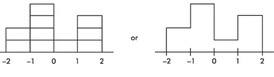
Bin choices matter. Different bin widths can make the same data look smoother or more jagged.
Example 1.2 (histogram with frequency vs relative frequency)
Suppose there are 2,200 seniors in a city’s six high schools. Four hundred take no AP classes, 500 take one, 900 take two, 300 take three, and 100 take four. These data can be displayed as a histogram:
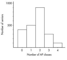
Sometimes, instead of labeling the vertical axis with frequencies, it is more meaningful to use relative frequencies (frequency divided by the total).
| Number of AP classes | Frequency | Relative frequency |
|---|---|---|
| 0 | 400 | 400/2200 = 0.18 |
| 1 | 500 | 500/2200 = 0.23 |
| 2 | 900 | 900/2200 = 0.41 |
| 3 | 300 | 300/2200 = 0.14 |
| 4 | 100 | 100/2200 = 0.05 |
A histogram using relative frequency on the vertical axis looks like:
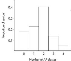
Important: the shape of the histogram is the same whether the vertical axis is frequency or relative frequency. Sometimes graphs show both.
Cumulative relative frequency plots (ogives)
A cumulative relative frequency plot shows, for each x-value (or class boundary), the proportion of observations at or below that value. This is useful for reading off medians, quartiles, and comparing distributions across time or groups.
(An extended comparison example using a cumulative frequency plot appears later in Example 1.12.)
Boxplots
A boxplot (box-and-whisker plot) summarizes the five-number summary and highlights potential outliers (using the 1.5×IQR rule). Boxplots are especially useful for comparing multiple groups on the same scale.
(A detailed boxplot explanation and an outlier computation example appear in the Numerical Summaries section.)
Exam Focus
- Typical question patterns:
- Match a variable type and situation to a dotplot, stemplot, histogram, ogive, or boxplot.
- Interpret a quantitative graph in context (shape, center, spread, unusual features).
- Explain how changing histogram bin width changes perceived shape.
- Common mistakes:
- Forgetting that histogram bars touch but bar chart bars do not.
- Confusing “more bars” with “more data” (binning changes bar count).
- Ignoring whether an axis is frequency or relative frequency.
Describing Quantitative Distributions (SOCS)
Graphs show the distribution; your job is to describe it clearly. A standard AP Statistics habit is to describe distributions using SOCS:
- Shape
- Outliers (and other unusual features)
- Center
- Spread
A complete description communicates not only what is typical but also variability and risk.
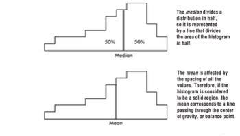
Center and spread as the core of “overall pattern”
Looking at a graph, two crucial aspects of the overall pattern are:
- Center: a value that roughly separates the observations (or, for histograms/density curves, the area) in half.
- Spread: the scope of values from smallest to largest, plus how concentrated or dispersed values are.
Shape vocabulary (and what it suggests)
Distributions come in endless varieties, but common patterns you should recognize include:
- Unimodal: one peak
- Bimodal: two peaks
- Symmetric: left and right halves are mirror images
- Skewed right: long thin tail toward higher values
- Skewed left: long thin tail toward lower values
- Bell-shaped: symmetric with a central mound and two sloping tails
- Uniform: histogram is roughly a horizontal line
A reliable skew check is that the “tail points to the skew.”
Clusters and gaps (unusual features that are not necessarily outliers)
In addition to outliers, look for:
- Clusters: natural subgroups where values tend to fall.
- Example: teacher salaries in Ithaca, NY might form three overlapping clusters (public school teachers, Ithaca College professors, Cornell University professors).
- Gaps: holes where no values fall.
- Example: if a dean writes letters only to honor-roll students and students on academic warning, the GPAs of letter recipients may show a large middle gap.
Outliers (and the 1.5×IQR rule)
An outlier lies unusually far from the rest of the data. Outliers can signal errors, special cases, or a different process, and they can strongly affect the mean and standard deviation.
AP Statistics often uses the 1.5×IQR rule to flag potential outliers:
- Values below:
- Values above:
These are potential outliers: they deserve attention, but are not automatically “mistakes.”
Example 1.3 (bimodality and clusters)
Hodgkin’s lymphoma is a cancer of the lymphatic system. Consider the histogram below:
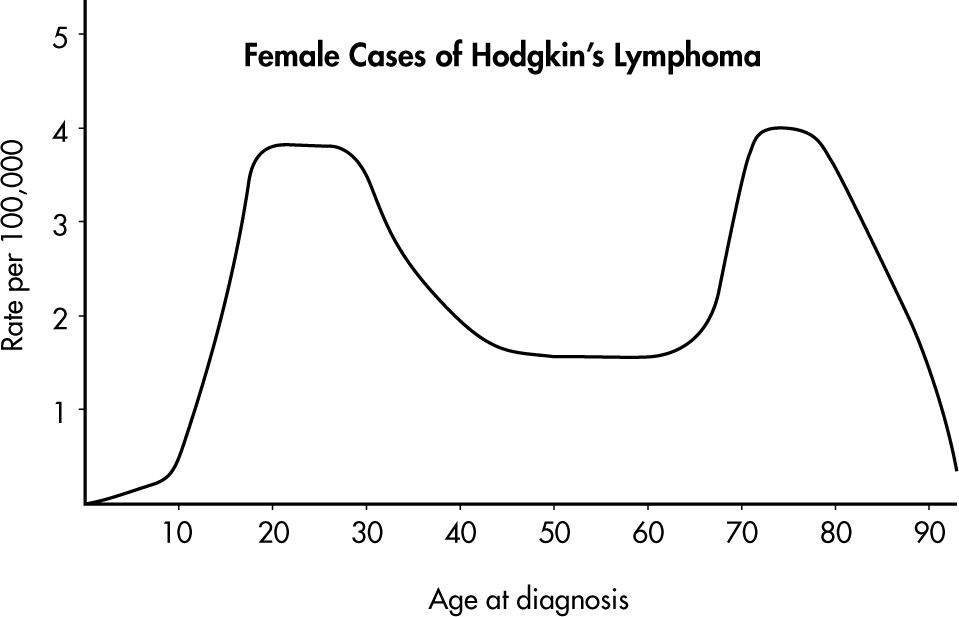
Simply saying “the average age is around 50” misses the most important feature. The distribution of ages at diagnosis for female cases is bimodal, with two distinct clusters centered near 25 and 75.
Worked example: SOCS description from a dotplot (conceptual)
If a dotplot of quiz scores shows most scores between 6 and 10, one peak around 8, and a single score at 1 separated by a gap, then:
- Shape: unimodal, left-skewed (tail toward low scores)
- Unusual: one low outlier around 1 (and a gap)
- Center: around 8
- Spread: most scores in a narrow band (6–10), but full range is larger due to the outlier
Exam Focus
- Typical question patterns:
- “Describe the distribution” using shape, center, spread, and outliers (and include clusters/gaps when present).
- Decide whether mean/median is a better center based on skew/outliers.
- Use the 1.5×IQR rule to identify potential outliers.
- Common mistakes:
- Reporting center/spread without describing shape or unusual features.
- Calling all far-away points “outliers” without a rule or explanation.
- Mixing up skew direction (remember: tail direction indicates skew).
Numerical Summaries: Center, Spread, and Position
Graphs are powerful, but numbers let you compare distributions precisely. Unit 1 emphasizes what common numerical summaries mean, how to compute them, and when each is appropriate.
Measures of center: mean and median
In everyday language, “average” often means a typical value or the center of a distribution. In statistics, two primary measures of center are the median and the mean.
Mean
The mean is the arithmetic average. For a sample of size n with values , the sample mean is:
The mean uses every value, so it reflects the overall balance point, but it is not resistant: outliers and skewness can pull it strongly.
The mean of a population is often denoted by the Greek letter mu (μ). The mean of a sample is often denoted by .
Median
The median is the middle value when data are ordered.
- If n is odd, the median is the single middle observation.
- If n is even, the median is the average of the two middle observations.
The median is resistant to outliers.
A common misconception is that the median is “the most common value.” That is the mode, which is not emphasized as much in AP Statistics because it can be unstable and less useful for later inference.
Example 1.4 (mean vs median with an outlier-like high end)
Home run distances (feet) to center field in 13 ballparks:
{387, 400, 400, 410, 410, 410, 414, 415, 420, 420, 421, 457, 461}
- The median is 414 (six values below and six above).
- The mean is computed by summing and dividing by 13 (shown in the referenced calculation image):
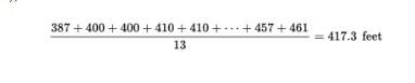
Numerically, the mean is about 417.3 feet, which is larger than the median because the high values (457, 461) pull the mean upward.
Measures of variability (dispersion)
Variability is the key to understanding statistics. Four primary ways of describing dispersion are range, interquartile range, variance, and standard deviation.
Range
The range is maximum minus minimum:
It is easy to compute but very sensitive to outliers.
Quartiles, five-number summary, and IQR
Quartiles divide ordered data into four roughly equal parts:
- First quartile Q1 is about the 25th percentile.
- Median (Q2) is the 50th percentile.
- Third quartile Q3 is about the 75th percentile.
The five-number summary is: minimum, Q1, median, Q3, maximum.
The interquartile range (IQR) measures the spread of the middle 50%:
IQR is resistant to outliers and skewness.
Important calculator note: calculators/software can compute quartiles slightly differently. On the AP exam, you typically use a provided five-number summary or your calculator output consistently. If computing by hand, the common approach is “median of the lower half / upper half” unless instructed otherwise.
Variance and standard deviation
The variance is the average squared deviation from the mean (using in the sample case). The sample variance is:
The standard deviation is the square root of the variance. The sample standard deviation is:
Interpretation: standard deviation is a typical distance of observations from the mean, in the original units. Standard deviation is not resistant; outliers inflate it.
Example 1.6 (multiple measures of variability, including two IQR methods)
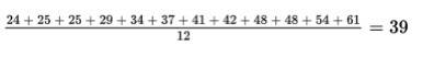
Ages of the 12 mathematics teachers at a high school:
{24, 25, 25, 29, 34, 37, 41, 42, 48, 48, 54, 61}
The mean is shown in the referenced computation image:
Measures of variability:
- Range: 61 − 24 = 37 years.
- Interquartile range (two methods shown in the original notes):
- Method 1 (remove the lower quarter {24, 25, 25} and upper quarter {48, 54, 61}, then take range of the remaining middle two quarters {29, 34, 37, 41, 42, 48}): 48 − 29 = 19 years.
- Method 2 (compute quartiles as medians of halves; quartile computations were shown in the original images):
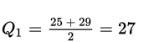
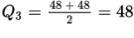
Using that method, Q1 = 27 and Q3 = 48, so IQR = 48 − 27 = 21 years.
- Variance:
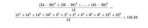
- Standard deviation:
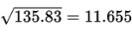
Interpretation: the teachers’ ages typically vary by about 11.655 years from the mean of 39 years.
Mean vs median as a shape clue
In a distribution spread thinly far to the low side (skewed left), the mean is usually less than the median. In a distribution spread thinly far to the high side (skewed right), the mean is usually greater than the median. This relationship is summarized visually in the referenced image:
Example 1.7 (using mean and median to infer skew)
Faculty salaries at a college have a median of $82,500 and a mean of $88,700. Because the mean is greater than the median, the distribution is probably skewed to the right: a few highly paid faculty members pull the mean upward.
Choosing summaries: mean & SD vs median & IQR
A key AP Statistics decision rule:
- If the distribution is roughly symmetric with no outliers, use mean and standard deviation.
- If the distribution is skewed and/or has outliers, use median and IQR.
Boxplots and the 1.5×IQR rule
A boxplot visualizes the five-number summary. Conceptually:
- The box spans Q1 to Q3.
- A line in the box marks the median.
- Whiskers extend to the smallest and largest observations not flagged as outliers.
- Outliers are plotted individually.
Worked example: five-number summary, IQR, and outliers
Data (minutes): 6, 7, 7, 8, 9, 10, 12, 25
1) Median (n = 8):
2) Q1 from lower half (6, 7, 7, 8):
3) Q3 from upper half (9, 10, 12, 25):
4) IQR:
5) Outlier fences:
So 25 is a potential outlier (above 17). Interpretation: most times are between about 6 and 12 minutes, with one unusually long time of 25 minutes.
Exam Focus
- Typical question patterns:
- Compute or interpret mean, median, IQR, variance, and standard deviation.
- Use mean vs median to infer skew.
- Use five-number summaries/boxplots to compare groups.
- Use the 1.5×IQR rule to identify potential outliers.
- Common mistakes:
- Using mean/SD automatically even when the distribution is skewed.
- Miscomputing quartiles by including/excluding the median inconsistently.
- Treating “potential outlier” as “must be removed” (you usually do not delete data without justification).
Percentiles, Relative Standing, and z-Scores
Sometimes you do not just want a “typical” value; you want to know how a particular observation compares to the rest. This is the idea of relative standing.
Three procedures for describing position
- Simple ranking: arrange values and note where a particular value falls.
- Percentile ranking: the percent of values at or below a given value.
- z-score: the number of standard deviations a value is above or below the mean.
Percentiles (percentile ranking)
A value’s percentile tells you the percent of observations at or below that value. If a score is at the 80th percentile, about 80% of scores are at or below it.
Common confusion: percentile is not the percent correct. A 90th percentile score is not “90% on the test.” It is a ranking.
Quartiles as special percentiles
- Q1 is about the 25th percentile.
- Median is the 50th percentile.
- Q3 is about the 75th percentile.
Standardizing with z-scores
A z-score standardizes a value as a number of standard deviations from the mean.
For a population with mean μ and standard deviation σ:
For a sample using and s:
Interpretation:
- means the value equals the mean.
- Positive z means above the mean; negative z means below the mean.
- Larger absolute z means more unusual relative to the spread.
z-scores are most meaningful when mean and standard deviation are meaningful summaries (often roughly symmetric data, or when explicitly using a Normal model).
Worked example: z-score and interpretation
A class’s exam scores have mean and standard deviation s = 6. A student scored 90.
Interpretation: the score is 2 standard deviations above the class mean.
Worked example: comparing two different tests with z-scores
Student A: 84 on a test with mean 80 and SD 4.
Student B: 92 on a test with mean 88 and SD 2.
Student B did better relative to their group.
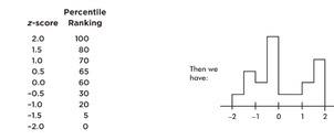
Example 1.8 (histograms, percentiles, and area)
Suppose we are asked to construct a histogram from the following information:
| z-score | −2 | −1 | 0 | 1 | 2 |
|---|---|---|---|---|---|
| Percentile ranking | 0 | 20 | 60 | 70 | 100 |
Because the entire area is between z = −2 and z = 2, we can break the area into bins:
- 20% between −2 and −1
- 40% between −1 and 0
- 10% between 0 and 1
- 30% between 1 and 2
Thus the histogram is:
Now suppose we are also given four in-between z-scores:
With 1,000 z-scores, the histogram might look smoother:
Key point: the height at any point is meaningless; what matters is relative areas.
Questions and answers from the original example:
- What percentage of the area is between z = 1 and z = 2? Still 30%.
- What percent is to the left of 0? Still 60%.
Exam Focus
- Typical question patterns:
- Interpret a percentile or convert a description into percentile meaning.
- Compute and interpret z-scores in context.
- Compare relative standing across distributions using z-scores.
- Interpret histograms in terms of area as proportion.
- Common mistakes:
- Saying “90th percentile means 90% correct.”
- Forgetting that the sign of z matters (above vs below mean).
- Comparing raw scores across different scales without standardizing.
How Linear Transformations Affect Data (Shifting and Rescaling)
Real data are often transformed: converting units, adjusting for inflation, adding a constant “curve” to test scores, and so on. AP Statistics expects you to understand how these transformations change summary statistics and graphs.
A linear transformation has the form:
where a is a shift (add/subtract) and b is a rescaling (multiply/divide).
What shifting does (adding a constant)
If you add a constant to every observation:
- Measures of center (mean, median, quartiles) increase by that constant.
- Measures of spread (IQR, standard deviation) do not change.
What rescaling does (multiplying by a constant)
If you multiply every observation by a constant:
- Measures of center multiply by that constant.
- Measures of spread multiply by the absolute value of that constant.
Formulas for mean and standard deviation under linear transformation
If , then:
How transformations affect shape and outliers
Shifting and rescaling do not change the basic shape (unimodal stays unimodal, skew stays skew), though the axis scale changes. Potential outliers remain potential outliers in the corresponding location (a high outlier stays high after shifting/rescaling).
Example 1.5 (mean under shifts and rescaling)
Salaries of six employees are %%LATEX65%%7,000, %%LATEX66%%22,000, $23,000, and $38,000.
a) Mean salary:
b) New mean if everyone receives a $3,000 increase: the mean increases by $3,000 to $21,000.
c) New mean if everyone receives a 10% raise: the mean is multiplied by 1.10 to $19,800.
The original notes included the worked computations as an image:
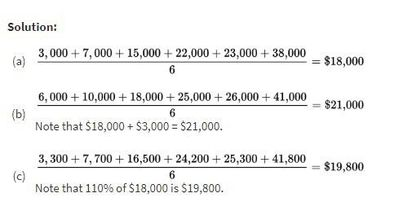
Example 1.5 illustrates the core rules: adding a constant adds to the mean; multiplying by a constant multiplies the mean.
Worked example: curving and unit conversion
Suppose quiz scores have mean and SD s = 8.
1) Curve by adding 5:
2) Convert points to a 0–10 scale by multiplying by 0.1:
Exam Focus
- Typical question patterns:
- Predict new mean/SD after adding a constant or multiplying by a constant.
- Interpret what a transformation does to center/spread in context (unit changes).
- Identify whether shape/outliers change under transformation.
- Common mistakes:
- Saying SD changes when adding a constant (it does not).
- Forgetting to multiply SD by under rescaling.
- Mixing up “new mean” with “new median” (both shift/scale similarly for linear transforms, but answer what is asked).
Comparing Distributions of Quantitative Data
A major skill in Unit 1 is comparing two (or more) distributions of the same quantitative variable across groups, such as test scores for two teaching methods.
A strong comparison does not just say “Group A is higher.” It explains how the distributions differ in center, spread, shape, and unusual features.
What a strong comparison includes
A complete comparison usually addresses:
- Center: which group tends to be higher/lower?
- Spread: which group is more variable?
- Shape: are they similarly skewed/symmetric? any multimodality?
- Outliers/unusual features: gaps, clusters, outliers
Side-by-side and paired displays
Common tools include:
- Back-to-back stemplots
- Side-by-side histograms/dotplots
- Parallel (side-by-side) boxplots
- Cumulative frequency (cumulative relative frequency) plots
A practical guideline: boxplots summarize; histograms and stemplots reveal shape details.
Comparing using numerical summaries
When you compare means, medians, IQRs, or SDs, interpret them in context (for example, “median waiting time is about 3 minutes shorter at Clinic A”). Also, avoid causal language unless the study design supports it.
Worked example: comparison from boxplots (conceptual)
If Store A’s boxplot has a higher median but a much larger IQR than Store B’s:
- Store A has the higher typical value.
- Store A is less consistent (more variable).
- “Higher” may be good or bad depending on context; always tie back to meaning.
Example 1.9 (back-to-back stemplot: NBA wins)
The numbers of wins for the 30 NBA teams at the end of the 2018–2019 season are shown in the following back-to-back stemplot:
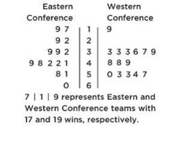
Comparison (shape, center, spread, unusual features):
- Shape: Eastern Conference (EC) is roughly bell-shaped; Western Conference (WC) is roughly uniform with a low outlier.
- Center: counting values (8th out of 15) gives medians %%LATEX41%% and %%LATEX42%%, so WC has the greater center.
- Spread: EC range is 60 − 17 = 43; WC range is 57 − 19 = 38, so EC has greater spread.
- Unusual features: WC has an apparent outlier at 19 and a gap between 19 and 33; EC has no apparent outliers or gaps.
Example 1.10 (side-by-side histograms: sleep hours)
Two surveys (high school students and college students) asked students how many hours they sleep per night. The following histograms summarize the distributions:
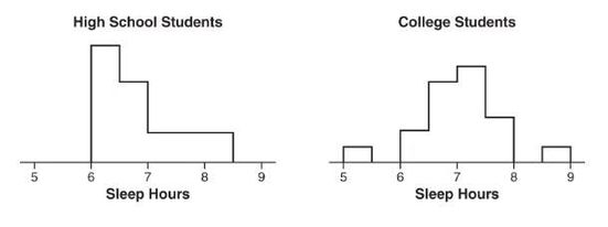
Comparison:
- Shape: high school distribution is skewed right; college distribution is unimodal and roughly symmetric.
- Center: the median for high school students (between 6.5 and 7) is less than the median for college students (between 7 and 7.5).
- Spread: the range for college students is greater than the range for high school students.
- Unusual features: the college distribution has two distinct gaps (5.5 to 6 and 8 to 8.5) and possible low and high outliers; the high school distribution does not clearly show gaps or outliers.
Example 1.11 (parallel boxplots over time: stock price fluctuations)
Parallel boxplots show daily price fluctuations of a stock over 5 years:
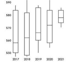
Trends described in the original solution:
- The median daily stock price steadily rose about 20 points from about $58 to about $78.
- The third quartile stayed roughly stable at about $84.
- The yearly low never decreased from the previous year.
- The IQR never increased from one year to the next.
- Lowest median was in 2017; highest was in 2021.
- Smallest spread (range) was in 2021; largest was in 2018.
- None of the distributions shows an outlier.
Example 1.12 (cumulative frequency plots: U.S. population ages)
The graph compares cumulative frequency plotted against age for the U.S. population in 1860 and 1980:
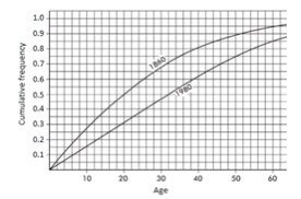
Comparing medians and IQRs:
- Median: in 1860, half the population was under age 20; in 1980, age 32 is needed to reach half.
- IQR: for 1860, Q1 = 9 and Q3 = 35 so IQR = 26 years; for 1980, Q1 = 16 and Q3 = 50 so IQR = 34 years.
Thus, both the median and IQR were greater in 1980 than in 1860.
Exam Focus
- Typical question patterns:
- Compare two distributions using SOCS-style language.
- Use side-by-side boxplots to compare medians and IQRs.
- Identify which group appears more variable and justify using IQR/SD (not just range).
- Interpret a cumulative frequency plot to compare medians and quartiles.
- Common mistakes:
- Comparing only centers and ignoring spread.
- Saying “more spread” based only on a larger range when outliers distort the range.
- Forgetting context: “higher median” is not automatically “better.”
Density Curves and the Normal Distribution
So far, data have been treated as a finite list of observations. For large populations, it can be useful to model the distribution as a smooth curve. That is where density curves come in.
Density curves as models
A density curve is a smooth curve describing the overall pattern of a distribution where:
- Total area under the curve equals 1.
- Area under the curve over an interval represents the proportion of observations in that interval.
Density curves are models, not the raw data. Modeling matters because it enables probability calculations.
The Normal distribution
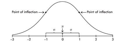
The Normal distribution is a valuable model for many natural phenomena and is often used to describe results of sampling procedures. The Normal curve is bell-shaped, symmetric, and has an infinite base.
A Normal distribution is determined by two parameters:
- μ: mean (center)
- σ: standard deviation (spread)
A Normal distribution is written as .
Key properties:
- Symmetric about μ.
- Mean = median = mode for a perfectly Normal model.
- There is a point on each side where the slope is steepest; these are points of inflection.
- The distance from μ to either inflection point is exactly one standard deviation (σ), so inflection points occur at approximately μ − σ and μ + σ.
Many real variables are approximately Normal in some contexts, but not all. For example, income distributions are often strongly right-skewed.
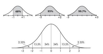
The Empirical Rule (68–95–99.7)
For a Normal distribution, approximately:
- 68% of values lie within μ ± σ
- 95% of values lie within μ ± 2σ
- 99.7% of values lie within μ ± 3σ
This rule applies specifically to Normal (approximately bell-shaped, symmetric) distributions.
The classic diagram is shown here:
Standard Normal distribution
The standard Normal distribution is . A standard Normal variable is often called Z. Any Normal distribution can be standardized to Z using z-scores.
Worked example: using the Empirical Rule
Suppose reaction times are approximately Normal with μ = 250 milliseconds and σ = 20 milliseconds.
- About 68% are between 230 and 270.
- About 95% are between 210 and 290.
This is an estimate, not an exact probability.
Example 1.13 (Empirical Rule in context)
Taxicabs in New York City are driven an average of 75,000 miles per year with a standard deviation of 12,000 miles.
Assuming the distribution is roughly Normal:
- About 68% are driven between 63,000 and 87,000 miles.
- About 95% are driven between 51,000 and 99,000 miles.
- Virtually all are driven between 39,000 and 111,000 miles.
The Normal curve and inflection-point labeling referenced in the original notes is shown here:
Exam Focus
- Typical question patterns:
- Identify or justify when a Normal model is reasonable (based on shape).
- Use the Empirical Rule to estimate proportions in intervals.
- Interpret μ and σ in context for a Normal model.
- Recognize that inflection points occur at μ ± σ.
- Common mistakes:
- Treating “Normal” as meaning “common” rather than a specific shape.
- Using the Empirical Rule for skewed distributions.
- Confusing parameters or order (for example, writing ).
Normal Distribution Calculations (Probabilities, Percentiles, and Normal Probability Plots)
Once you assume a Normal model, you can compute probabilities (areas under the curve) and percentiles (cutoff values). AP Statistics cares most about correct setup and correct contextual interpretation.
Converting to z using the Normal model
If X is Normal with mean μ and standard deviation σ, then:
The core probability connection is:
Left-tail, right-tail, and between probabilities
Think in pictures (areas under a curve), then translate:
- Left-tail:
- Right-tail:
- Between:
Technology (normalcdf, invNorm) or a standard Normal table is usually used.
Finding a percentile (inverse Normal)
A percentile corresponds to a left-tail area. To find the 90th percentile of X, solve for x such that:
Procedure:
1) Find z such that .
2) Convert back:
Normal probability plots (assessing Normality)
A Normal probability plot (Normal quantile plot) graphs ordered data against expected Normal quantiles.
- Points close to a straight line suggest a Normal model is reasonable.
- Systematic curves suggest skewness or other non-Normal features.
- Extreme points far from the line may indicate outliers.
Worked example: Normal probability between two values
Assume heights are approximately Normal: %%LATEX54%% where X is height in inches. Find %%LATEX55%%.
1) Standardize endpoints:
2) Convert to standard Normal:
3) Using table/technology:
Using common table approximations, this is about 0.7495 (about 75%). Interpret in context: about 75% of heights are between 65 and 72 inches under this model.
Worked example: finding a cutoff (90th percentile)
Suppose SAT practice scores are modeled as . Find the 90th percentile.
A common approximation is:
Convert back:
So the 90th percentile is about 623. Interpretation: about 90% of students score at or below about 623 under the model.
Exam Focus
- Typical question patterns:
- Compute Normal probabilities for less than, greater than, or between values using z-scores.
- Find a percentile (cutoff) using inverse Normal reasoning.
- Use a Normal probability plot to assess whether Normal calculations are appropriate.
- Common mistakes:
- Mixing up right-tail vs left-tail (forgetting to subtract from 1).
- Using and s vs μ and σ inconsistently (use what the problem gives).
- Reporting calculator output without a contextual interpretation.