AP Statistics Unit 2 Study Guide: Exploring Two-Variable Data (Tables, Scatterplots, Correlation, Regression, and Causation)
Understanding Association in Two-Variable Data
In AP Statistics, you often start by studying one variable at a time (one-variable data) to describe its distribution (center, spread, shape). With two-variable data, the goal shifts: you want to understand whether (and how) the values of one variable tend to change as the other changes.
An association is a relationship between two variables where knowing the value of one variable gives you information about the likely value of the other. Many real questions are relationship questions, such as whether studying is associated with scores, exercise with resting heart rate, or brand preference with age group.
Types of variables and which displays fit
The tools you choose depend on whether the variables are categorical or quantitative.
- A categorical variable places individuals into groups (blood type, political party, yes/no).
- A quantitative variable records numerical values with meaningful arithmetic (height, number of siblings, time).
| Variable 1 | Variable 2 | Typical tools in Unit 2 |
|---|---|---|
| Categorical | Categorical | Two-way tables, conditional relative frequencies, segmented bar charts, mosaic plots |
| Quantitative | Quantitative | Scatterplots, correlation, linear regression, residual plots |
Response vs. explanatory variables (the “direction” of the relationship)
For two quantitative variables, you usually label one as the explanatory (predictor) variable %%LATEX0%% and the other as the response variable %%LATEX1%%.
- %%LATEX2%% is the variable you think might explain or help predict changes in %%LATEX3%%.
- is the outcome you want to predict or understand.
This labeling does not prove causation; it is mainly a modeling/communication choice that makes later interpretations (slope, intercept) clear.
Individuals and paired data
Two-variable data are paired: each individual contributes one value for each variable (one ordered pair). A very common error is treating the two lists as if they were separate one-variable datasets instead of matched pairs.
Exam Focus
- Typical question patterns:
- Identify variable types and choose an appropriate display (two-way table vs. scatterplot).
- Decide which variable should be explanatory and which should be response.
- Interpret what it would mean for two variables to be “associated.”
- Common mistakes:
- Treating two-variable data like two separate one-variable lists (ignoring pairing).
- Calling a variable quantitative just because it uses numbers (ZIP code is categorical).
- Assuming “explanatory” automatically means “causes.”
Categorical–Categorical Relationships: Two-Way Tables, Marginals, and Conditional Relative Frequency
When both variables are categorical, you don’t compute correlation or regression. You look for association by comparing proportions across categories.
Two-way tables: organizing counts (joint, marginal, and table total)
A two-way table (also called a contingency table) displays counts for combinations of categories.
- Each interior cell is a joint frequency (a row-and-column combination).
- Row totals and column totals are marginal frequencies (or marginal totals).
- The grand total (sum of all cells) is the table total, often called .
Two-way tables matter because they let you answer questions like “How common is category A within group B?” That is the categorical version of describing association.
Example 2.1: The Cuteness Factor (two-way table structure + marginals)
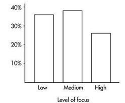
A Japanese study had 250 volunteers look at pictures of cute baby animals, adult animals, or tasty-looking foods, before testing their level of focus in solving puzzles.
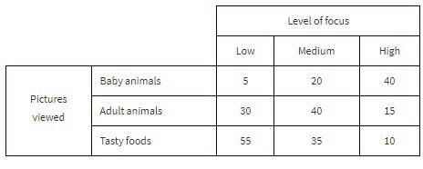
Key vocabulary in context:
- The grand total of all cell values (250) is the table total.
- “Pictures viewed” is the row variable, and “level of focus” is the column variable.
A typical joint-frequency question:
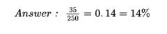
- What percent of the people in the survey viewed tasty foods and had a medium level of focus?
Standard analysis begins by computing row and column totals (the marginal frequencies), shown in the margins of the table.
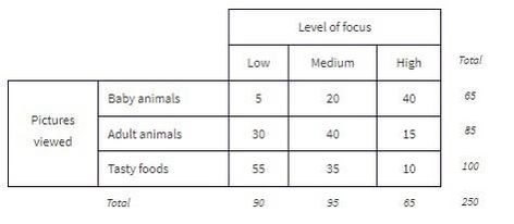
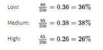
From those marginals, you can compute marginal distributions (percentages/proportions for a single variable, ignoring the other variable). For example, the marginal distribution of “level of focus”:
And its bar graph:
Similarly, you can compute the marginal distribution for “pictures viewed”:
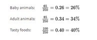
And its bar graph:
Conditional relative frequency: the core tool for association
To check for association with categorical variables, you compare conditional relative frequencies (conditional percentages). A conditional relative frequency is a proportion computed within a condition (within a row or within a column).
For example:
- “Among seniors, what proportion prefer online homework?” (condition: seniors)
- “Among students who prefer online homework, what proportion are seniors?” (condition: prefer online homework)
If conditional proportions differ meaningfully across groups, that suggests an association.
Choosing row vs. column conditionals (and writing conclusions that match)
A reliable approach:
- Decide which variable is the grouping variable (often the explanatory variable).
- Compute conditional relative frequencies of the response variable within each group.
- Compare those conditional proportions and write your conclusion in context.
The direction you condition on changes the meaning, so your writing must match your calculation.
Graphs for two categorical variables
- Segmented bar chart: each bar is a group; segments show conditional relative frequencies, so each bar totals 1 (or 100%). This is excellent for comparing proportions.
- Mosaic plot: similar idea, but widths can reflect group sizes, so you see both sample sizes and conditional proportions.
Worked example: testing for association in a two-way table
Suppose a survey asks students whether they prefer “morning classes” or “afternoon classes,” and records grade level.
| Grade level | Morning | Afternoon | Total |
|---|---|---|---|
| 9th | 30 | 70 | 100 |
| 10th | 45 | 55 | 100 |
| 11th | 60 | 40 | 100 |
| 12th | 55 | 45 | 100 |
| Total | 190 | 210 | 400 |
If grade level is explanatory and preference is response, compute conditional proportions of “Morning” within each grade:
- 9th: Morning proportion
- 10th: Morning proportion
- 11th: Morning proportion
- 12th: Morning proportion
These are not close, so there appears to be an association.
A strong AP-style conclusion:
There is an association between grade level and class-time preference. For example, about 30% of 9th graders prefer morning classes, compared to about 60% of 11th graders.
What can go wrong: misleading comparisons and Simpson’s paradox (conceptual)
Associations in categorical data can be distorted by a lurking third variable. Sometimes an overall association reverses or disappears when you split into meaningful subgroups, a phenomenon often called Simpson’s paradox. You may not have to compute a full paradox example, but you should recognize the danger of mixing groups.
Exam Focus
- Typical question patterns:
- Compute and compare conditional relative frequencies to determine association.
- Write a context-based conclusion using conditional percentages.
- Choose or interpret a segmented bar chart or mosaic plot.
- Common mistakes:
- Comparing marginal percentages (overall totals) instead of conditional percentages.
- Conditioning in the wrong direction, then writing an interpretation that doesn’t match.
- Claiming causation from survey/observational data.
Quantitative–Quantitative Relationships: Scatterplots and Describing Patterns
Many important applications involve examining whether two or more quantitative variables are related. These are bivariate quantitative datasets.
Scatterplots: the essential visual display
A scatterplot graphs each individual as a point and gives an immediate visual impression of a possible relationship between two variables. You should always “look first,” because numerical summaries (like correlation) can be misleading for nonlinear patterns or in the presence of outliers.
Positive vs. negative association
- Positively associated: larger values of one variable tend to be paired with larger values of the other.
- Negatively associated: larger values of one variable tend to be paired with smaller values of the other.
The strength is gauged by how closely points cluster around a clear form (often a straight line).
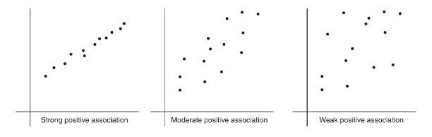
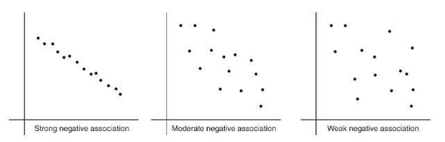
How to describe a scatterplot (AP standard)
To describe a scatterplot, address form, direction, strength, and unusual features (outliers, clusters, gaps), and always include context.
- Direction: as %%LATEX11%% increases, does %%LATEX12%% tend to increase (positive), decrease (negative), or neither?
- Form: linear, curved, or another shape?
- Strength: weak, moderate, strong (how tightly clustered around the form?)
- Unusual features: outliers, clusters, gaps.
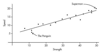
Example 2.2: Comic book heroes (scatterplot and linearity)
Comic book heroes and villains can be compared on attributes. The scatterplot below looks at speed (20-point scale) versus strength (50-point scale) for 17 characters. Does there appear to be a linear association?
Adding a third variable visually
If you have a third (often categorical) variable, you can add it to a scatterplot using different colors or symbols. This can reveal that what looks like one relationship is actually different relationships for different subgroups.
Worked example: describing a scatterplot (no computation yet)
Imagine %%LATEX13%% is number of practice problems completed and %%LATEX14%% is quiz score. If the points rise with , follow a roughly straight form, show moderate scatter, and include one point far from the pattern, then a strong description is:
There is a moderately strong, positive, roughly linear association between number of practice problems completed and quiz score. Students who complete more practice problems tend to score higher. There is one unusual point: a student who completed many problems but scored much lower than expected.
Why “form first” prevents mistakes
Correlation and least-squares regression are linear tools. A strong curved relationship can have %%LATEX16%% near 0, and a correlation near %%LATEX17%% or does not automatically prove a linear model is the best model if other issues (like outliers or curvature) exist.
Exam Focus
- Typical question patterns:
- Describe a relationship using direction, form, strength, and outliers in context.
- Decide whether a linear model is appropriate based on the scatterplot.
- Identify and interpret clusters, gaps, and outliers.
- Common mistakes:
- Saying “no relationship” just because correlation is near (might be nonlinear).
- Forgetting context (describing the plot without naming variables).
- Ignoring unusual points that will heavily affect correlation/regression.
Correlation and the Coefficient of Determination
A scatterplot gives a visual sense of association; correlation gives a numerical summary of the direction and strength of a linear relationship.
Correlation : what it measures
The correlation between two quantitative variables is denoted .
- The sign of %%LATEX22%% matches direction: %%LATEX23%% positive, negative.
- The magnitude %%LATEX25%% indicates strength of linear association: values near %%LATEX26%% or %%LATEX27%% are strong; values near %%LATEX28%% are weak.
Important limitations:
- measures only linear association.
- is unitless.
- is not resistant: outliers can change it substantially.
Correlation is based on standardized values (and why units don’t matter)
A standardized value is a -score:
Correlation is the average product of paired standardized values:
Equivalently, written in terms of raw data:
Consequences you must know:
- Changing units (multiplying by a constant) does not change .
- Adding a constant to all %%LATEX38%% values (or all %%LATEX39%% values) does not change .
- Interchanging which variable is called %%LATEX41%% and which is called %%LATEX42%% does not change (the formula is symmetric).
- %%LATEX44%% is always between %%LATEX45%% and .
Worked example: interpreting a correlation value
If %%LATEX47%% is outside temperature and %%LATEX48%% is daily electricity use, and , then:
There is a strong negative linear association between outside temperature and electricity use: on warmer days, electricity use tends to be lower.
Common errors:
- Correlation is not a slope (it has no units).
- Correlation is not a percent and does not imply causation.
Outliers and correlation
Outliers can weaken correlation by adding scatter, strengthen it if they fall along the existing trend, or even reverse direction in extreme cases. This is why you should check the scatterplot before trusting .
Coefficient of determination : what it means
The coefficient of determination is (for least-squares regression with one explanatory variable).
You should interpret it as:
%%LATEX53%% is the proportion of the variation in %%LATEX54%% that is accounted for by the least-squares regression of %%LATEX55%% on %%LATEX56%%.
It is between 0 and 1, loses the sign of , and is not a statement of causation.
A useful variance-partition identity is:
This matches the idea that is 1 minus the proportion of unexplained variation.
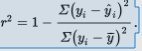
Example 2.3: interpreting from a correlation
The correlation between Total Points Scored and Total Yards Gained (college football teams, 2021 season) is . Then:
Interpretation:
70.56% of the variation in Total Points Scored can be accounted for (predicted by, explained by) the linear relationship between Total Points Scored and Total Yards Gained. The other 29.44% remains unexplained.
Also remember: when recovering %%LATEX63%% from %%LATEX64%%, %%LATEX65%% can be positive or negative, and %%LATEX66%% takes the same sign as the slope of the regression line.
Exam Focus
- Typical question patterns:
- Interpret a given in context (direction and strength of linear association).
- Decide whether correlation is appropriate (look for linear form and outliers).
- Interpret %%LATEX68%% as “proportion of variation in %%LATEX69%% accounted for by the linear model,” in context.
- Convert between %%LATEX70%% and %%LATEX71%% (handling the sign of ).
- Common mistakes:
- Treating correlation as a slope or as a percent.
- Assuming means “no relationship” (might be nonlinear).
- Interpreting as “percent of points on the line” or as a causal statement.
- Forgetting that a high does not automatically guarantee linear regression is appropriate without checking plots.
Linear Regression and Least-Squares: Building and Interpreting the Best-Fit Line
Correlation measures linear strength; linear regression provides an actual prediction model.
A regression line is written:
- %%LATEX77%% is the predicted value of %%LATEX78%%.
- is the intercept.
- is the slope.
Interpreting slope and intercept (always in context, with units)
Slope interpretation:
For each increase of 1 unit in %%LATEX81%%, the predicted value of %%LATEX82%% changes by units, on average.
Intercept interpretation:
%%LATEX84%% is the predicted %%LATEX85%% when .
Whether the intercept is meaningful depends on whether makes sense in context.
Example: interpreting slope and intercept
If hours studied is %%LATEX88%% and test score (points) is %%LATEX89%%, and:
Then:
- Slope : each additional hour studied increases the predicted score by about 6.8 points.
- Intercept : a student who studies 0 hours is predicted to score about 12.5 points (only meaningful if 0 hours is realistic).
Prediction vs. extrapolation
Regression predictions are most trustworthy within the observed range of . Predicting outside that range is extrapolation, which is riskier because the trend may not continue.
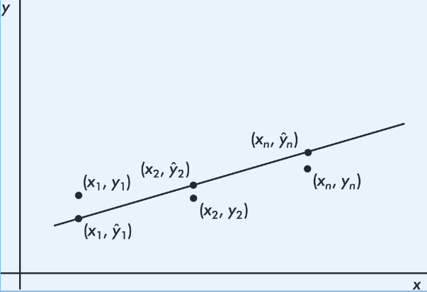
Least-squares regression: what “best” means
Many lines could be drawn through a scatterplot. The least-squares regression line is the line that minimizes the sum of squared vertical residuals.
By “best-fitting” we mean the line minimizing:

Key properties and formulas connecting and regression
The least-squares line always passes through .
A convenient point-slope form that emphasizes this is:
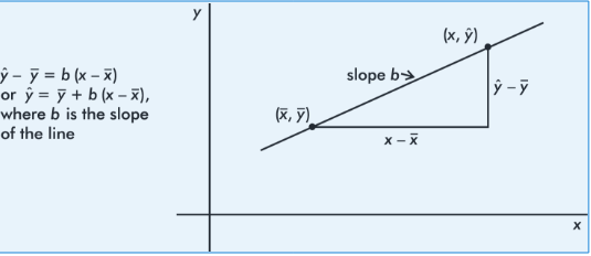
The slope is connected to correlation and standard deviations:

And the intercept is:
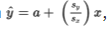
A useful standardized-data fact: if you graph %%LATEX100%%-scores for %%LATEX101%% against %%LATEX102%%-scores for %%LATEX103%%, the slope is exactly , and the regression equation becomes:

Interpretation connection: each standard deviation change in %%LATEX106%% results in a change of %%LATEX107%% standard deviations in predicted .
Worked example: compute a regression line from summary statistics
Given:
- %%LATEX109%%, %%LATEX110%%
- %%LATEX111%%, %%LATEX112%%
Compute slope:
Compute intercept:
So:
Example 2.4: teens, close friends, and evening Facebook checks
A sociologist surveys 15 teens. Let %%LATEX117%% be the number of “close friends,” and %%LATEX118%% be the number of times Facebook is checked every evening.
| 25 | 23 | 30 | 25 | 20 | 33 | 18 | 21 | 22 | 30 | 26 | 26 | 27 | 29 | 20 | |
|---|---|---|---|---|---|---|---|---|---|---|---|---|---|---|---|
| 10 | 11 | 14 | 12 | 8 | 18 | 9 | 10 | 10 | 15 | 11 | 15 | 12 | 14 | 11 |
Tasks included:
- Identify the variables.
- Draw a scatterplot.
- Describe the scatterplot.
- Find the regression line. Interpret the slope in context.
- Interpret the coefficient of determination in context.
- Predict evening Facebook checks for a student with 24 close friends.
Solution highlights (as given):
- Explanatory variable %%LATEX121%%: number of close friends. Response variable %%LATEX122%%: number of evening Facebook checks.
Scatterplot:
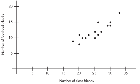
Description: linear, positive, strong.
Calculator regression:
(Also shown in the note as a formatted equation image.)

Slope interpretation (as stated): each additional close friend leads to an average of 0.5492 more evening Facebook checks.
Given %%LATEX124%%, then %%LATEX125%%, so 78% of the variation in evening Facebook checks is accounted for by variation in number of close friends.
Prediction for :
So the model predicts about 11.45 evening Facebook checks.
More on regression: interpreting in standard deviation units
The regression relationship implies a useful “standard deviation shift” interpretation.
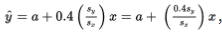
- If %%LATEX129%%, then the predicted %%LATEX130%% increases by exactly one %%LATEX131%% for each increase of one %%LATEX132%% in .
- If %%LATEX134%%, then the predicted %%LATEX135%% increases by 0.4 standard deviations of %%LATEX136%% for each one-standard-deviation increase in %%LATEX137%%.
Example 2.8: movie attendance and popcorn sales (predicting %%LATEX138%% from %%LATEX139%%)
Suppose %%LATEX140%% is attendance at a movie theater and %%LATEX141%% is number of boxes of popcorn sold, with a roughly linear relationship. The problem provides summary statistics (shown below) and asks for predicted popcorn sales at given attendance values.

- When attendance is 250, what is the predicted number of boxes of popcorn sold?
- When attendance is 295, what is the predicted number of boxes of popcorn sold?
Solution work (as shown):
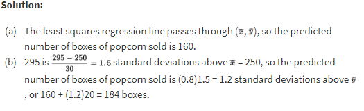
The example also notes that the regression equation for predicting %%LATEX142%% from %%LATEX143%% has slope:

Example 2.9: predicting attendance from popcorn sales (predicting %%LATEX144%% from %%LATEX145%%)
Using the same attendance/popcorn summary statistics as Example 2.8:
- When 160 boxes of popcorn are sold, what is the predicted attendance?
- When 184 boxes of popcorn are sold, what is the predicted attendance?
Solution work (as shown):
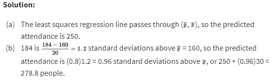
A key reminder embedded in these examples is that “regression of %%LATEX146%% on %%LATEX147%%” is not the same as “regression of %%LATEX148%% on %%LATEX149%%.” Swapping roles changes the regression line.
Exam Focus
- Typical question patterns:
- Interpret slope and intercept in context (with correct units and “predicted” language).
- Use a regression equation to make a prediction and interpret .
- Recognize that predicting %%LATEX151%% from %%LATEX152%% is different from predicting %%LATEX153%% from %%LATEX154%%.
- Identify and critique extrapolation.
- Common mistakes:
- Interpreting slope backwards (mixing up %%LATEX155%% and %%LATEX156%%).
- Giving unitless interpretations (slope must carry %%LATEX157%%-units per %%LATEX158%%-unit).
- Treating the intercept as meaningful when is not in context.
Residuals, Residual Plots, and Diagnosing the Regression Model
Once you fit a regression line, you must check whether a line is actually a reasonable model.
Residuals: definition and interpretation
A residual is the difference between an observed and a predicted value:
Geometrically, it is the vertical distance from the point to the regression line.
- A positive residual means the model underestimated the actual response.
- A negative residual means the model overestimated the actual response.
Worked example: residual calculation and interpretation
Using:
If %%LATEX162%% and actual %%LATEX163%%, then:
Residual:
Interpretation: the actual %%LATEX166%% is 3 units below what the model predicted at %%LATEX167%%.
A key least-squares fact: residuals sum to zero
In least-squares regression, the sum (and mean) of the residuals is always zero.
Example (from the note): predicted values are computed and subtracted from observed values to obtain residuals.
| 30 | 90 | 90 | 75 | 60 | 50 | |
|---|---|---|---|---|---|---|
| 185 | 630 | 585 | 500 | 430 | 400 | |
| 220.3 | 613.3 | 613.3 | 515.0 | 416.8 | 351.3 | |
| -35.3 | 16.7 | -28.3 | -15.0 | 13.2 | 48.7 |
And indeed:
Residual plots: what they are and how to read them
A residual plot graphs residuals on the vertical axis against %%LATEX173%% (or sometimes against %%LATEX174%%).
- If a linear model is appropriate, residuals should look like random scatter around 0.
- A visible pattern suggests the linear model is missing something.
What to look for:
- Curvature: suggests nonlinearity.
- Changing spread (fan shape): suggests non-constant variability.
- Outliers: points with large residuals.
- Clusters/gaps: suggests subgroups or a missing variable.
Standard deviation of residuals (typical prediction error)
Regression output often includes the standard deviation of residuals, labeled %%LATEX176%% (or sometimes %%LATEX177%%):
Interpretation:
Predictions from the regression line are typically off by about %%LATEX179%% (in %%LATEX180%%-units).
Exam Focus
- Typical question patterns:
- Compute a residual and interpret it (including sign) in context.
- Interpret residual plots: identify curvature, changing spread, and outliers.
- Interpret %%LATEX181%% as a typical prediction error in %%LATEX182%%-units.
- Common mistakes:
- Computing residual as (wrong sign).
- Thinking a “good” residual plot should show a strong trend (it should not).
- Confusing a residual plot with a scatterplot (axes and meaning differ).
- Ignoring changing variability (fan shape) and focusing only on curvature.
Outliers, Influential Points, and Leverage
In regression, not all unusual points matter equally. Some are just far from the line (large residuals), while others can substantially change the fitted line.
Regression outliers
In a scatterplot, regression outliers are points far from the overall pattern, meaning they have relatively large discrepancies between observed %%LATEX184%% and predicted %%LATEX185%%. In residual terms, a point is a regression outlier if its residual is an outlier among residuals.
Example 2.5: GPA versus weekly television time (regression outliers)
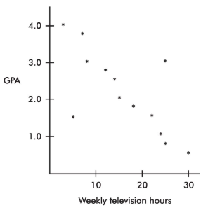
From direct observation, the note identifies two outliers:
- One person watches 5 hours weekly but has a 1.5 GPA.
- Another person watches 25 hours weekly but has a 3.0 GPA.
It also makes an important distinction: while 30 weekly hours of television might be an outlier in the %%LATEX186%%-variable and 0.5 GPA might be an outlier in the %%LATEX187%%-variable, the point is not an outlier in the regression context because it follows the straight-line pattern.
Influential points
Influential scores are points whose removal would sharply change the regression line. Often (though not always), influence is tied to extreme -values.
A point can have a small residual but still be influential, and a point can have a large residual but not be influential if it sits near the center of the values.
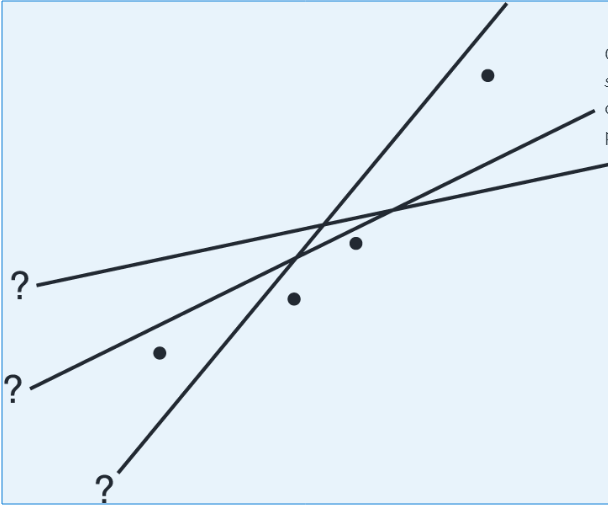
Example: removing point A vs point B (influence)
Consider the following scatterplot of six points and the regression line:
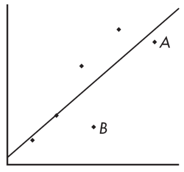
The heavy lines below show what happens when point A is removed (left) and when point B is removed (right):
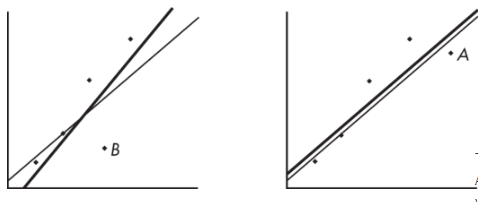
The regression line changes greatly when A is removed but not when B is removed, so A is influential and B is not, even though A is closer to the original line.
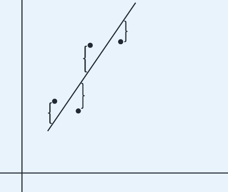
Leverage
A point has high leverage if its %%LATEX191%%-value is far from the mean of the %%LATEX192%%-values. High leverage gives a point strong potential to change the regression line. If it lines up with the overall pattern, it might not change the regression equation much, but it could strengthen %%LATEX193%% and %%LATEX194%%.
Example 2.7: leverage and influence patterns (A–D)
Each scatterplot has a cluster plus one separated point:
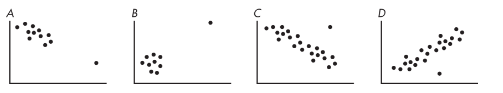
As summarized in the note:
- In A, the additional point has high leverage, a small residual, and does not appear influential.
- In B, the additional point has high leverage, probably a small residual, and is very influential (removing it would change the slope dramatically).
- In C, the additional point has some leverage, a large residual (regression outlier), and is somewhat influential.
- In D, the additional point has no leverage, a large residual (regression outlier), and is not influential.
Exam Focus
- Typical question patterns:
- Identify regression outliers vs. influential points vs. high-leverage points from a plot.
- Explain (conceptually) how removing a point could change slope/intercept and .
- Common mistakes:
- Assuming any outlier is influential (influence depends heavily on leverage).
- Focusing only on large residuals and ignoring extreme values.
Transformations to Achieve Linearity
If the scatterplot or residual plot shows clear curvature, you can sometimes transform one or both variables to make the relationship more linear. Useful transformations often use %%LATEX197%% or %%LATEX198%% (and sometimes power transforms like square root) to create new variables and then re-check linearity.
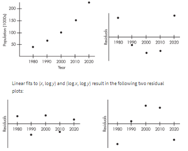
Example 2.10: years and population (transformation idea)
Data:
| Year | 1980 | 1990 | 2000 | 2010 | 2020 |
|---|---|---|---|---|---|
| Population (1000s) | 44 | 65 | 101 | 150 | 230 |

The note states that 94.3% of the variability in population is accounted for by the linear model (a very high ), but the scatterplot and residual plot indicate a nonlinear relationship would be even stronger.
Exam Focus
- Typical question patterns:
- Recognize curvature in a scatterplot/residual plot and suggest that a transformation could help.
- Explain why a high alone is not enough if residual plots show patterns.
- Common mistakes:
- Treating transformation as “automatic” without checking whether it improves linearity.
- Ignoring residual-plot evidence of nonlinearity.
Interpreting Regression Output From Technology (Calculator/Computer)
On the AP exam, you may be given regression output and asked to translate it into statistical meaning.
What output typically includes
- Regression coefficients: intercept %%LATEX203%% and slope %%LATEX204%%
- %%LATEX205%% and/or %%LATEX206%%
- Standard deviation of residuals %%LATEX207%% (sometimes labeled %%LATEX208%%)
- Sometimes a table of predicted values and residuals
Reading the equation and interpreting coefficients
If output gives intercept = 48.2 and slope = -1.35, then:
Interpretations must:
- Identify %%LATEX211%% and %%LATEX212%% in context
- Include units
- Use “predicted” language
Using output to make predictions and compute residuals
To predict at a specific :
- Substitute into .
- Interpret as a predicted response.
To compute a residual:
- Compute .
- Compute .
- Interpret sign (above/below) and magnitude in context.
Deciding whether a linear model is appropriate (output + plots)
Even with a high , check scatterplots and residual plots when provided.
A linear model is generally reasonable when:
- Scatterplot shows a roughly linear form.
- Residual plot shows random scatter around 0 with roughly constant spread.
- No extreme influential points dominate.
A linear model may be questionable when:
- Clear curvature appears.
- Residual spread changes strongly.
- One high-leverage point appears to drive the slope.
Worked example: interpreting a full regression summary
Given:
Interpretations:
- Slope: each 1-unit increase in %%LATEX222%% increases predicted %%LATEX223%% by 0.73 units.
- %%LATEX224%%: about 81% of the variation in %%LATEX225%% is accounted for by the linear regression of %%LATEX226%% on %%LATEX227%%.
- %%LATEX228%%: observed %%LATEX229%% values typically differ from predicted values by about 2.4 -units.
Exam Focus
- Typical question patterns:
- Write the regression equation from output and interpret slope/intercept.
- Interpret %%LATEX231%% and %%LATEX232%% in context.
- Use the equation to predict and then interpret a residual.
- Common mistakes:
- Forgetting the word “predicted” when interpreting coefficients.
- Treating %%LATEX233%% like the standard deviation of %%LATEX234%% (it is the standard deviation of residuals).
- Trusting alone without checking for nonlinearity or influential points.
Correlation, Regression, and Causation: What You Can and Cannot Conclude
A strong correlation or a well-fitting regression line describes association, not necessarily cause-and-effect.
Why correlation/regression cannot prove causation
A strong relationship can occur because:
- A lurking variable affects both %%LATEX236%% and %%LATEX237%%.
- Confounding is present (common in observational studies).
- The direction is reversed (maybe %%LATEX238%% affects %%LATEX239%%).
- The pattern is coincidental or driven by data-collection methods.
Classic example: ice cream sales and drowning incidents may be positively correlated because hot weather increases both.
Observational studies vs. experiments
Observational study: researchers observe and record without assigning treatments.
- You can conclude association.
- You generally cannot conclude causation.
Controlled experiment with random assignment:
- Supports a cause-and-effect conclusion (for the participants), if well designed.
Also remember the AP distinction:
- Random assignment supports causation.
- Random sampling supports generalizing to a population.
Confounding (clear meaning)
Two variables are confounded when their effects on a response cannot be separated. For example, in comparing scores of students who choose tutoring vs. those who do not, differences in motivation or prior knowledge can confound the relationship.
Worked example: choosing the correct conclusion
Scenario A (observational): sleep hours and GPA with .
Students who sleep more tend to have higher GPAs (a moderate positive linear association), but this does not prove that more sleep causes higher GPA.
Scenario B (randomized experiment): volunteers randomly assigned to 6 hours vs. 8 hours of sleep per night for 3 weeks, then tested.
If the 8-hour group scores higher, the researcher can conclude that increasing sleep from 6 to 8 hours caused higher test scores for these participants, assuming the experiment was well controlled.
Exam Focus
- Typical question patterns:
- Decide whether a study supports causation, association only, or neither.
- Identify a lurking/confounding variable that could explain an association.
- Rewrite an invalid causal statement into a valid association statement.
- Common mistakes:
- Claiming causation from correlation/regression in observational data.
- Mixing up random sampling (generalization) with random assignment (causation).
- Ignoring plausible confounders when interpreting a relationship.