Dot plots and frequency tables review
Dot plots and frequency tables are nice ways to organize and display data. To see how they work, we'll need some data.
Every four years, soccer teams from around the world compete in the World Cup. The following list shows the number of goals scored in the championship game of each World Cup from 1930-2014:
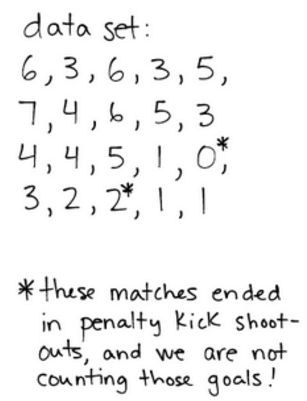
This data set is interesting, but it’s too disorganized. Let’s organize it into a frequency table and also a dot plot.
Frequency table

The frequency table (right) organizes the data nicely. At a glance, we can tell that the most common number of goals (the mode) is 3.
Dot plot
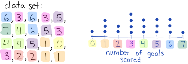
The dot plot (right) is very similar to the frequency table, but instead of using numbers to show frequency, it uses dots. Each dot represents a data point.